Monday, February 22, 2010

Class Exercise E: Talking Form

In lecture today we learned about the basic elements of an image - point, line, shape (plane), form(3-D), value (tone), color, texture - and we had to come up with two images conveying meanings of two words out of a list of words, incorporating some of these elements.

We had chosen "passage" and "order" and they are represented by the below images respectively. For "passage", the key idea was depth, as all passages link two points distant from each other. Using lines receding to the center, it gives the audience a 3-D perspective of a tunnel inwards, supplemented by the lines on the walls on both sides. The lines come closer together towards the center of the picture, to show depth and distance, along with the differently-sized ovals on the ceiling and thinning lines on the foreground.

For "order", we simply made use of 9 points, evenly spaced out in a squarish shape, to show orderliness, like soldiers on a parade. We find order in simplicity and feels that it is easy for viewers to perceive the message easily.


Sunday, February 21, 2010

Class Exercise D: Photo Compositions

When talking about photos, angles play a very important role in expression of emotions and ideas.

We were tasked to take a few shots of a subject, using different camera angles and compositions.

The 'bottom-up' shot:


 -Taken using camera from a lower position with respect to the subject. Normally used by political leaders or individuals with power, to depict vision, power and authority.

The 'top-down' shot:


-Taken using camera from a higher angle as compared to the subject. This is a portrayal of weakness, vulnerability and helplessness in the subject. Effective in portrayal of the needy or during disasters to evoke sympathy.

The 'long-shot':


-A composition whereby the subject is taken together with the surroundings. This give the viewers an idea of how the subject interacts with the environment.

Saturday, February 20, 2010

Class exercise C: Iconic and Indexical

Gist of the lecture: pictogram and semantics. 

We were asked to form groups of two or three, choose an object and represent it in it's iconic and indexical form. The iconic form bearing direct indication to the signified object in this case an iPod and the indexical form bearing some indication to the iPod.

Here, my groupmate and I have come up with a sketch of the iPod which is an icon and the musical note which is an indexical signifier as the iPod is an mp3 player which plays music and music consist of musical notes in part. On top of that in our cultural context, the musical note is indicative of music as a whole, thus we used it as an indexical signifier.


Friday, February 5, 2010

Class Exercise B : Constructive Criticism

In this week's lecture, we were asked to perform constructive criticism on any design or a piece of artwork. Constructive criticism is aimed at evaluating a piece or artwork or design, in this case I have selecting a piece or artwork, basically giving my two cents worth of opinion and advice, targeted at aiding the artist to improve his/her artwork.

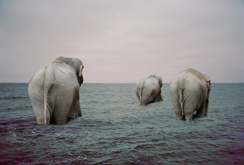
Below is what I have retrieved from the web.


Basically what you can see in the picture is three elephants, supposedly from another photo, being superimposed onto another photo of a still seawater.  

The color tone used in this image is rather dull, comprising of largely blue to gray tones, yet soothing to the eyes. This color selection might be a good way to portray the tranquility and consistency of the image as implied by the use of calm waters and elephants, which are known to be gentle giants. 

The elephants are somewhat positioned around the center of the image, thus granting importance and focus on them. On top of that, the elephants are of different sizes and placed strategically to give depth to the entire picture, so that it does not turn out to be too two dimensional of poorly composited.

The greatest issue I have with this picture is the poor use of CG tools like photoshop or illustrator as could be seen around the area where the elephants' legs are submerged in the water. The artist could probably add more ripples and blending around the legs of the elephants so that it does not look like it was just cropped and pasted on the water. Moreover, the water seemed too deep for the elephants to literally walk as if they we walking on the sea bed. This could either be solved by using an image of the seawater near the shore with the elephants just entering the water or for a more abstract connotation, the elephants can be portrayed as if they were walking on the surface of the water itself.

Overall it was a nice idea but I think it requires more work, depth and profound usage of CG tools in creating the image.