Monday, April 12, 2010

Assignment 5: Infographic


Fighting climate change. Everyone has a part to play. In this infograph, I have outlined the causes of climate change starting from how fossils fuels are produced, to the uncontrolled use of fossil fuel by men to the effects of burning fossil fuel and global warming on the environment. Lastly are the 3 simple steps one can take to reduce carbon emission to fight global warming.

Articles:

http://en.wikipedia.org/wiki/Global_warming
http://www.nrdc.org/globalwarming/gsteps.asp

The design priciple here used is largely consistency, in terms of fonts and proportion of every aspects of the infograph like the part depicting the droughts and the melting glaciers. The way the information is arranged has a circular pattern.

It starts with the middle left portion of the fossil fuel section, where the line flows in from outside of the paper, drawing attention to intersections. Subsequently, one will follow the respective infographs along the globe and finally reaching the solutions part.


To give the infograph an environmentally friendly 'look' I made use of green for the background as it is representative of going green. On top of that, the other colors used are lagely earth-tone and dull so that the gravity of the situation could be understood. Moreover, readers of such magazines like national geographic and newsweek are audiences who have a certain educational standard, thus the overall professional look ought to be achieved.

Assignment 4: Color Coalition

When it comes to designing, composition plays a very important role. In order for a design to have an aesthetic appeal, not only must there be a good composition but also a complimentary color
scheme.


The design principles that I had applied here is basically the fibobacci spiral, starting from the word “Danceworks!” in the middle, which is the main focus, going up clockwise from the leg of the dancer up to his hand where it flows along the lines of the words “Inaugural Dance Competition” to the next few captions and lastly ends on the prohibition sign with the drugs inside.

The reason why I used this composition was because it was able to guide the viewers along the design and convey the message that the danceworks! competition is a competition which focuses on fighting drug abuse.

The overall feel of the design was dynamic and the lines are flowy and energetic as the target audience are youths. The color schemes that I had explored were also ‘loud’ and vibrant as it portrays youthfulness and joy.


The final design that I had chosen was basically what I felt was the most vibrant and attention-grabbing piece, after surveys with my friends and some youths.

The white "Danceworks!" with the flare glowing immediately grabs the attention of viewers at a glance, in contrast to the dark background. Following the flow, with the principle of consistency, it brings attention to the shoes of the dancer, which is in white as well, followed by the arch in the dancer's body movement, leading to the hands in a circular motion.

Viewers will then read the four captions of words which are in a curved flowy manner to portray the concept of youthfulness in motion and finally to lead to the 'drugs out' prohibition sign to complete the picture.

Assignment 3: U C what I C

Some say a picture says a thousand words. What happens when you put a few pictures together? You can tell a story.

Through a series of pictures, we are supposed to illustrate a story with or without a twist.

In line with my street life concept, I decided to work on the theme of dance, and tell a story about it. At the same time, I wanted to incorporate some little facts about life in the story, and a twist at the end. I also wanted to inject some humour in the story which explains the unconventional use of a banana as a main character.

Here is my storyboard... See if you can decipher the story and it's meaning...


Well here it goes... In the first picture is a banana surfing the internet as he was bored. I used the long shot to show the banana's interaction with the surroundings, i.e. the laptop.

The next two pictures are actually a point of view shot, with the banana at the foregound near the camera and the laptop screen with the ballet and breakdancing picture. The reason this shot was used was to give focus to the pictures on the laptop screen but at the same time showing that the banana is viewing the pictures as well.

For the subsequent 2 pictures number 4 and 5, it shows the banana is deciding between taking up ballet of breakdancing. Once again the long shot was used to show interaction with the surrounding and also to give space for insertion of his visible 'thoughts'. The rule of thirds was applied as well so that the banana is in the middle of the images, as focus is on him thinking. As seen from his expression, it seems he prefer breakdancing.

However after consulting his friend orange, portrayed using an over the shoulder shot to illustrate conversation, he decided to go do ballet as his orange suggested that.

For picture 7, it shows another point of view shot of banana going for ballet class. 

Lastly, the twist of the story..... Banana ended up being eaten at the ballet class or another interpretation would be banana split!

The underlying value in life in this story is that one must always follow your heart, no matter what others tell you or influence you. You do the things that you love; only then you will not look back and regret.

-The End-


Sunday, April 4, 2010

Assignment 2 : Less is More (abstraction)

I have decided to work on my theme of street life of which I had always been indulged in. Pictograms can be found at every corner of the street, on road signs to books to product logo... basically anywhere. These are visual representations of objects in reality, in the form of simple words, images or a combination of both, used to easily convey messages, prohibitions, warnings, indications, directions etc. 

Graffiti is advent in Singapore, be it along the alleyways in Haji Lane, or along the walls of private properties. However there is no pictorial prohibition sign around indicating no vandalizing locally. Therefore I have decided to perform the extraction process on the following picture of a man doing graffiti on a wall to transform it into an imperative indexical sign for "no vandalizing":


Specifically, I made use of the simpification, which is the reduction of details, zooming in and cropping to achieve the abovementioned process. Lastly, the addition of the red prohibition sign over the final abstraction to suggest that vandilism is a banned action and is reinforced by law.

Indicator (void decks)


Friday, April 2, 2010

Assignment 1: Me myself & I

any people often overlook the importance of the designing process and jump into the draft / final product.

The designing process consists of brainstorming, thumb-nailing, sketches, roughs and finally the final completed piece, which still require a process of evaluation and feedback to further improve it.

Well, at lecture we were tasked with the brainstorming and thumbnail process, by writing down words related to oneself in various aspects, then from these draw ideas for several thumbnails to widen our scope of ideas, so that better ideas could be sieved from within and built on.


Subsequently, from these thumbnails, we have to come up with four sketches, where our scope will be narrowed down from the wide range of ideas in the brainstorming stage. I have selected the following four ideas for exploration.

In the end, i decided to use the bottom left idea of a person breakdancing as I felt it was more abstract and I wish to portray my name in a form of dance which is an integral part of my life.


I then worked on the idea  using a person dancing to make out the letters of my name as dance is an expression of words and ideas through movements.

After a session of constructive criticism in tutorial, I decided to choose the bottom piece out of the two roughs as I felt the first was more an an engraving of my name on the wall instead of into the design.


This is my final prototype:
For my final prototype, I decided to use another person to further illustrate and integrate my name as my roughs were not pretty well integrated. Furthermore, I decided to give the entire piece a brick texture as I intended it to appear as if it was a graffiti on the wall. Dance and the street is the love of my life and I believe that this is a good portrayal of my name and what represents me well.

However, feedbacks obtained from my tutorial mates was that the letter 'g' in my name was not able to be seen clearly, therefore I came up with another interpretation of the letter 'g' into a capital letter 'G', and i tweaked the colors of the picture so that it appears more vibrant - a distinct feature of street life, especially hip hop dance.


"Art is a delayed echo."
-George Santayana

Monday, February 22, 2010

Class Exercise E: Talking Form

In lecture today we learned about the basic elements of an image - point, line, shape (plane), form(3-D), value (tone), color, texture - and we had to come up with two images conveying meanings of two words out of a list of words, incorporating some of these elements.

We had chosen "passage" and "order" and they are represented by the below images respectively. For "passage", the key idea was depth, as all passages link two points distant from each other. Using lines receding to the center, it gives the audience a 3-D perspective of a tunnel inwards, supplemented by the lines on the walls on both sides. The lines come closer together towards the center of the picture, to show depth and distance, along with the differently-sized ovals on the ceiling and thinning lines on the foreground.

For "order", we simply made use of 9 points, evenly spaced out in a squarish shape, to show orderliness, like soldiers on a parade. We find order in simplicity and feels that it is easy for viewers to perceive the message easily.


Sunday, February 21, 2010

Class Exercise D: Photo Compositions

When talking about photos, angles play a very important role in expression of emotions and ideas.

We were tasked to take a few shots of a subject, using different camera angles and compositions.

The 'bottom-up' shot:


 -Taken using camera from a lower position with respect to the subject. Normally used by political leaders or individuals with power, to depict vision, power and authority.

The 'top-down' shot:


-Taken using camera from a higher angle as compared to the subject. This is a portrayal of weakness, vulnerability and helplessness in the subject. Effective in portrayal of the needy or during disasters to evoke sympathy.

The 'long-shot':


-A composition whereby the subject is taken together with the surroundings. This give the viewers an idea of how the subject interacts with the environment.

Saturday, February 20, 2010

Class exercise C: Iconic and Indexical

Gist of the lecture: pictogram and semantics. 

We were asked to form groups of two or three, choose an object and represent it in it's iconic and indexical form. The iconic form bearing direct indication to the signified object in this case an iPod and the indexical form bearing some indication to the iPod.

Here, my groupmate and I have come up with a sketch of the iPod which is an icon and the musical note which is an indexical signifier as the iPod is an mp3 player which plays music and music consist of musical notes in part. On top of that in our cultural context, the musical note is indicative of music as a whole, thus we used it as an indexical signifier.


Friday, February 5, 2010

Class Exercise B : Constructive Criticism

In this week's lecture, we were asked to perform constructive criticism on any design or a piece of artwork. Constructive criticism is aimed at evaluating a piece or artwork or design, in this case I have selecting a piece or artwork, basically giving my two cents worth of opinion and advice, targeted at aiding the artist to improve his/her artwork.

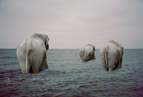
Below is what I have retrieved from the web.


Basically what you can see in the picture is three elephants, supposedly from another photo, being superimposed onto another photo of a still seawater.  

The color tone used in this image is rather dull, comprising of largely blue to gray tones, yet soothing to the eyes. This color selection might be a good way to portray the tranquility and consistency of the image as implied by the use of calm waters and elephants, which are known to be gentle giants. 

The elephants are somewhat positioned around the center of the image, thus granting importance and focus on them. On top of that, the elephants are of different sizes and placed strategically to give depth to the entire picture, so that it does not turn out to be too two dimensional of poorly composited.

The greatest issue I have with this picture is the poor use of CG tools like photoshop or illustrator as could be seen around the area where the elephants' legs are submerged in the water. The artist could probably add more ripples and blending around the legs of the elephants so that it does not look like it was just cropped and pasted on the water. Moreover, the water seemed too deep for the elephants to literally walk as if they we walking on the sea bed. This could either be solved by using an image of the seawater near the shore with the elephants just entering the water or for a more abstract connotation, the elephants can be portrayed as if they were walking on the surface of the water itself.

Overall it was a nice idea but I think it requires more work, depth and profound usage of CG tools in creating the image.

Tuesday, January 12, 2010

Class Exercise A: Creativity Amplifier


First in-class assignment..

We were tasked to create a device/machine that could amplify creativity by 100 times. Wow.


First thing that came to me mind was... Omg. First assignment of the semester! My mind went blank for a moment. Then the most obvious of ideas came to mind. Why not simply use an amplifier to amplify and some device to receive and transmit the ideas?

At times, good designs do not necessary mean coming up with a whole deal of complicated out-of-the-world ideas that upon laying eyes by the layman draws a big question mark.

The idea that i came up with may not be brand new or very much creative, but the picture explains itself and is easily perceived by its observer.

-Creativity does not necessarily equate to innovation; turn old ideas into new ones.

Monday, January 11, 2010

Design vs Art

Day 1 of school, first lecture of the semester..

Well, 0ne key concept that intrigued me is the difference between design and art covered in today's lecture.

While it was commonly known that design = art and vice versa, in actual fact a design involves more than mere artistic talent itself. It has more restrictions, a specific target audience and a message to be conveyed. Designers are tasked with problems by their clients, and challenged to use their artistic abilities to creatively solve the problem and mould the end-product suited to the liking of one's client.

On the other hand, a piece of art commonly involves a problem in which an artist comes up with and aim to solve or express the problem using one's creativity, almost without any limits in presentation and end product.

-Anyone can be an artist, but it takes more than art to be a true designer.

Friday, January 1, 2010

Adobe Illustrator

First lesson..

Well it was my first time using adobe illustrator, under proper guidance. It was a fun process of discovering how to trace outline for real objects and turning them into vectors. We were taught how to add gradient onto vectors, and being ambitious i tried to add patterns and shadow.

And viola! With a touch of photoshop, here is what i came up with...


-Walking on the flip-side of life.